Projects / High Sierra Custom Door
Modernizing a Successful Door Company
Introduction
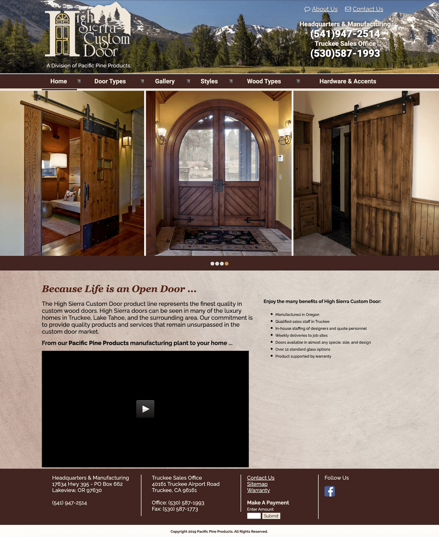
Giving an established, reputable, custom door company a remodel. Creating a visual representation that identified with their ideal target audience. High Sierra Custom Door is based in Truckee, California, working for big name clients and 5 star contractors. Over the years there had been no changes to their digital footprint, and competitors made them look more and more like a "Mom & Pop".
Scope of work
Branding
Website
Timeline
02/2024 - 03/2024
02/2024 - 08/2024
Live since 01/2025:
"You’re the best of the best Gabby. Your last name reflects what you bring to the customers fortunate enough to have you work on their projects."
-Key Stakeholder
The Problem
Losing to the competition
The outdated web design and content made HSCD look incapable when compared with competitors.
Clients couldn't picture doors like these on their new modern homes. Designers and contractors couldn't use the websites content to help sell HSCD to their clients.
This made it near impossible to get new contracts when their subcontractors had to use competitor websites to help sell HSCD. As a custom door company, they weren't showing what they were capable of.
Along with content issues, the website was riddled with accessibility issues.
The Challenge
Making it easy to do business
For contractors:
Contractors don't really care what the door looks like, they want to make sure that they can get custom fittings for their home in whatever style the homeowner wants. Contractors like doing business with HSCD because they can do custom fittings, good delivery, and pre-hung doors.
For designers:
Designers want to see a portfolio of work so that they can sell HSCD to their clients and create a custom design that fits their home. The designers care about creating a balanced design for the home, which is easy to do with a custom door company.
The Soultion
Complete overhaul
Rewriting the experience
Rewriting the content was a top priority. Outdated messaging was creating problems for the brand, and wasn't clearly communicating to the target audience. We restructured the website and rewrote the content to match the current capabilities, while optimizing it for new business.
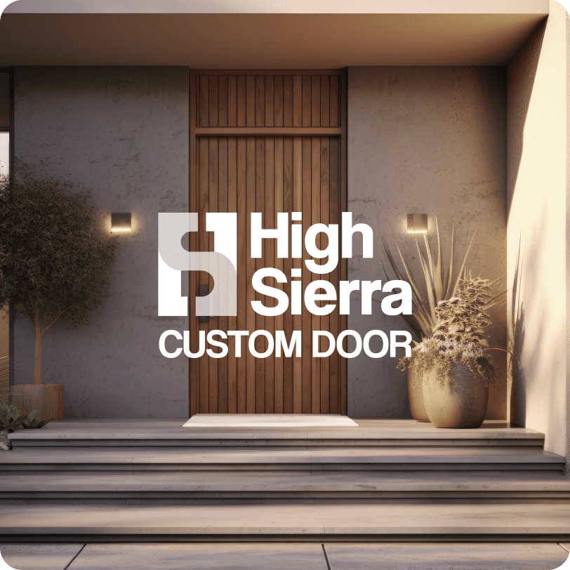
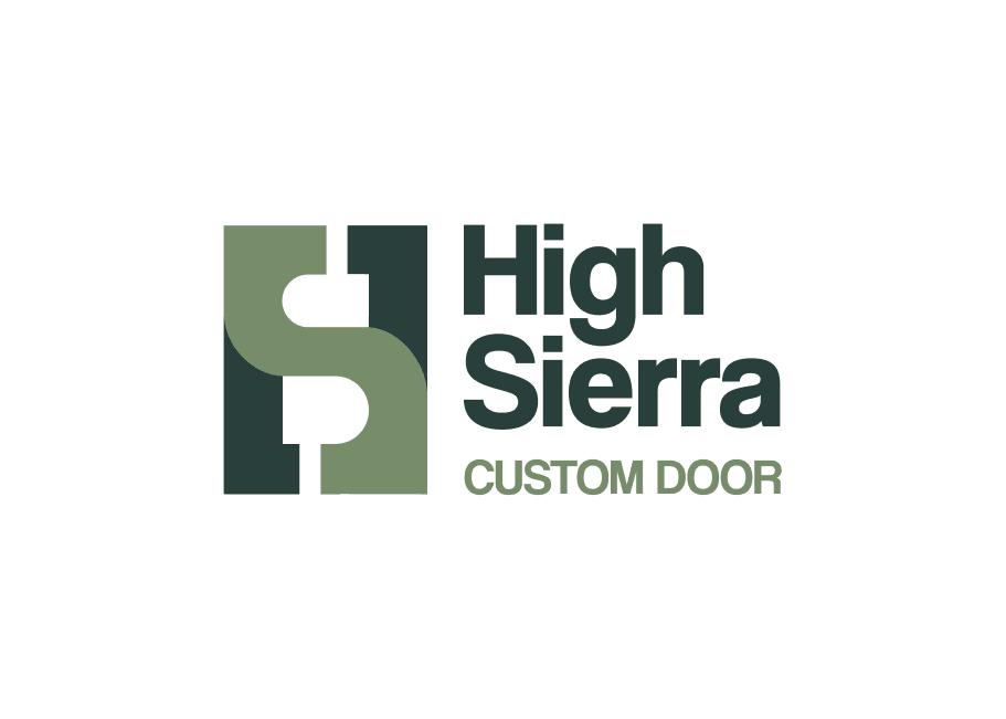
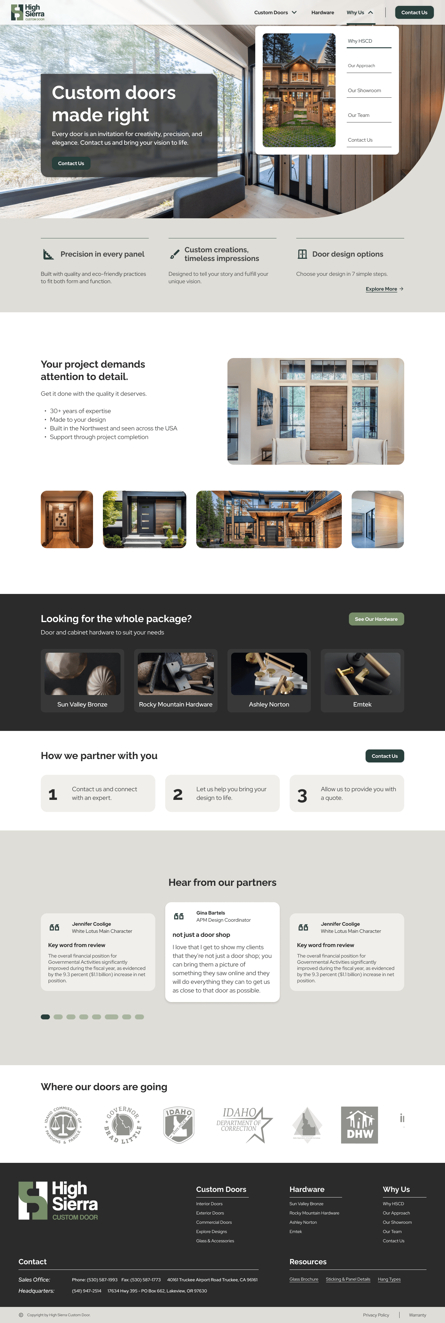
Brand & web design
Using competitor's brands and websites as reference for industry standard, I rebranded HSCD to stay true to it's first brand, while creating a more modern image. The web design is modeled after more modern websites and the updated branding to make room in the industry for HSCD to show up as a true competitor.
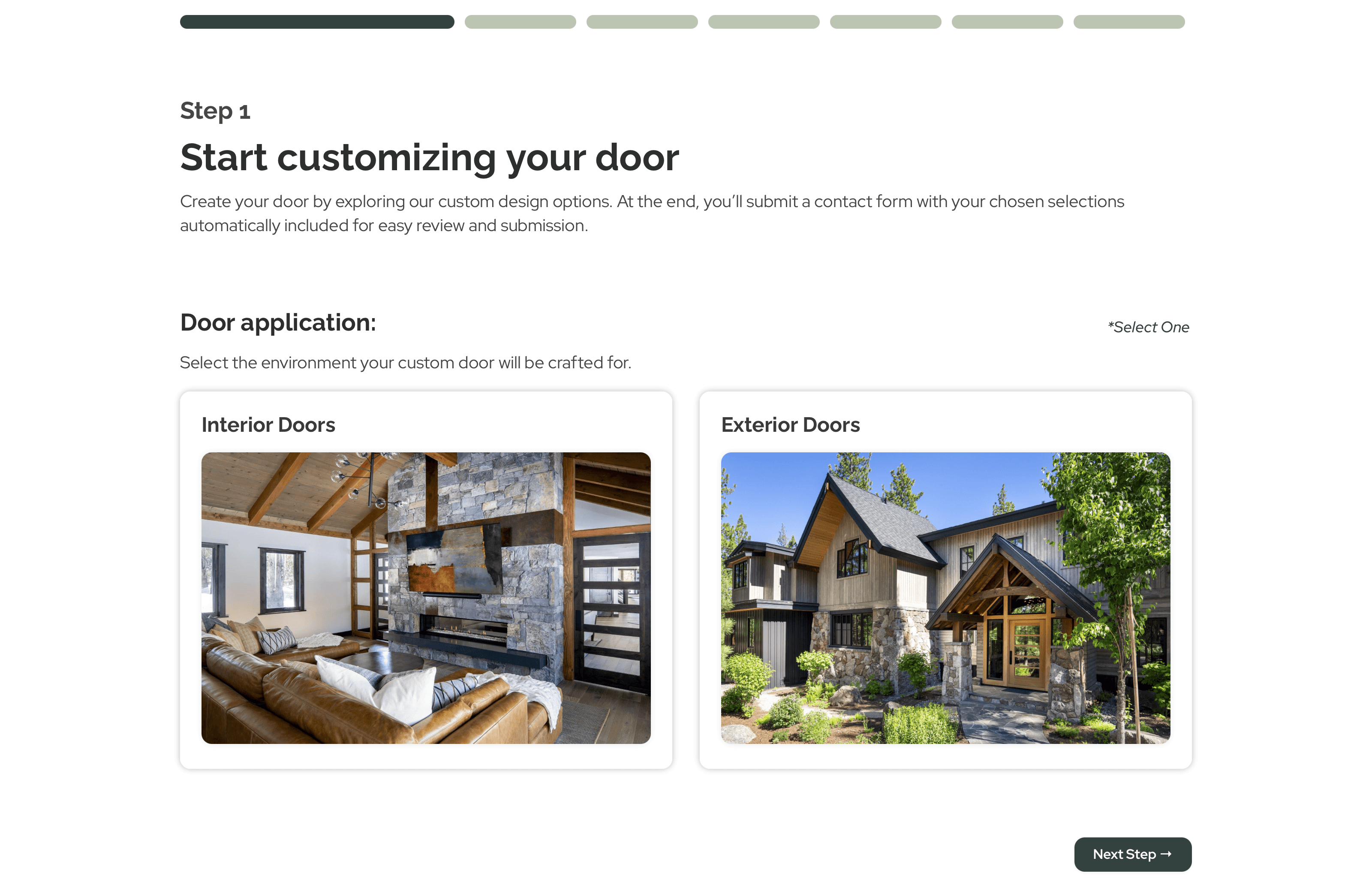
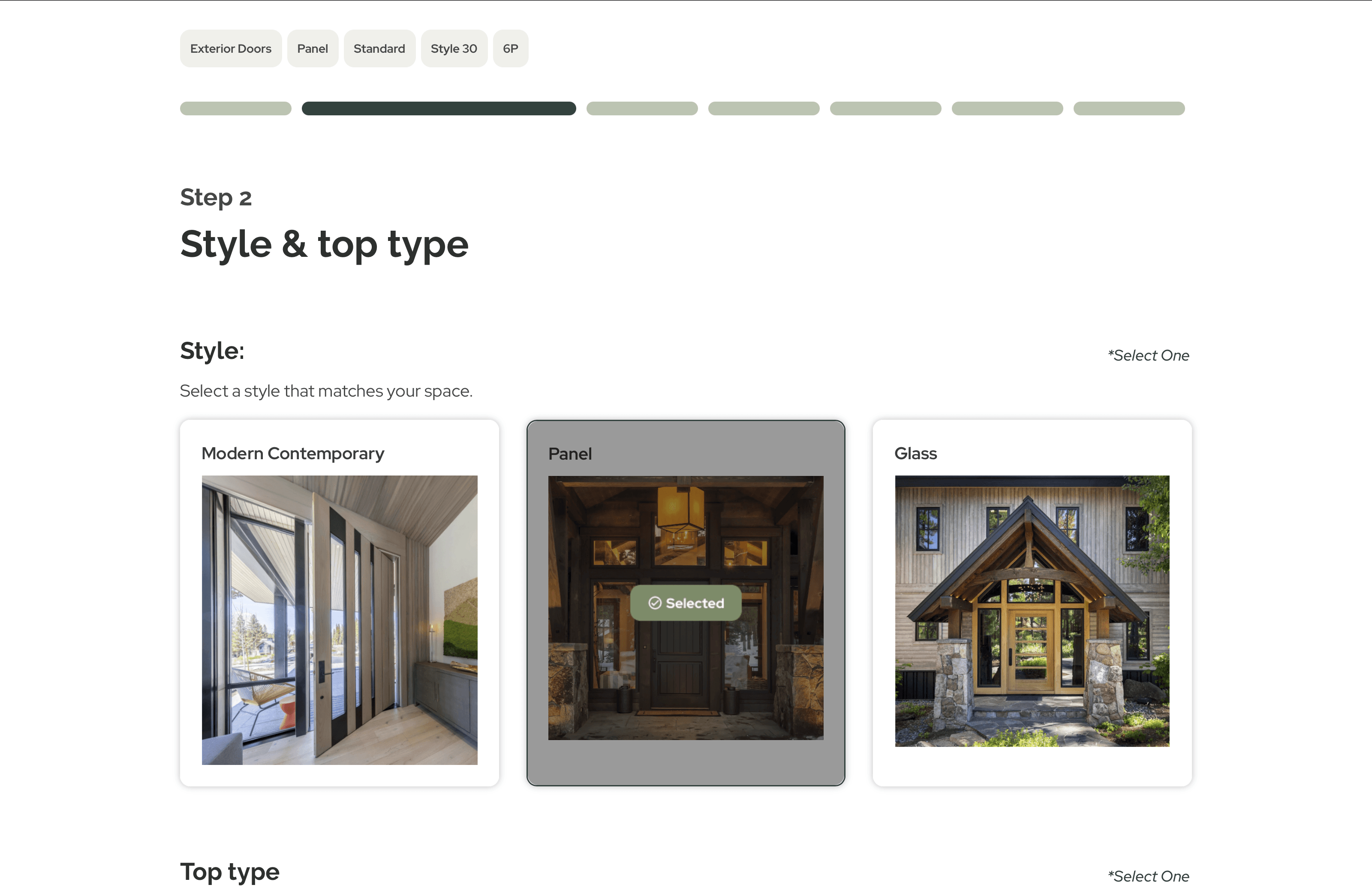
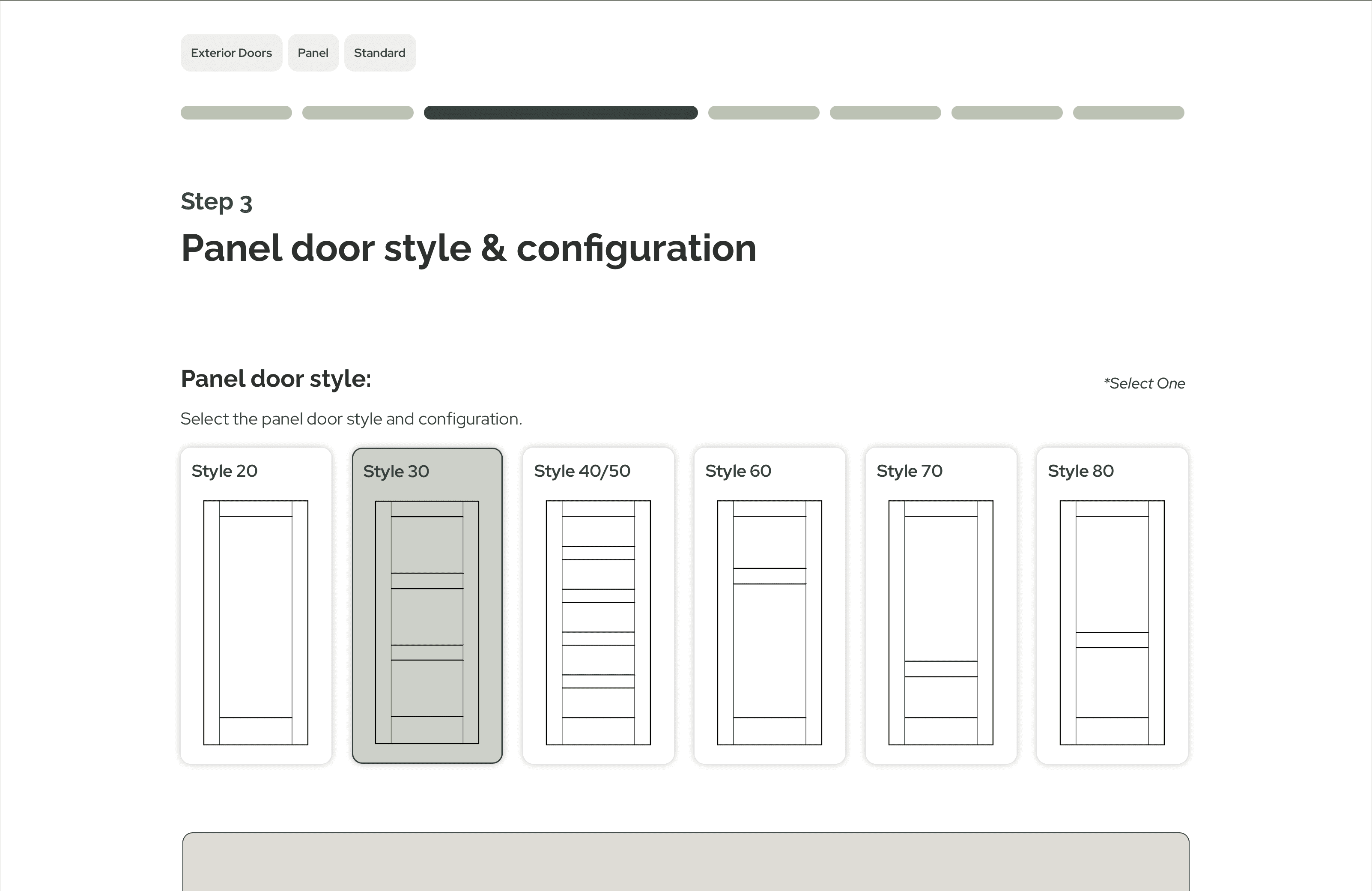
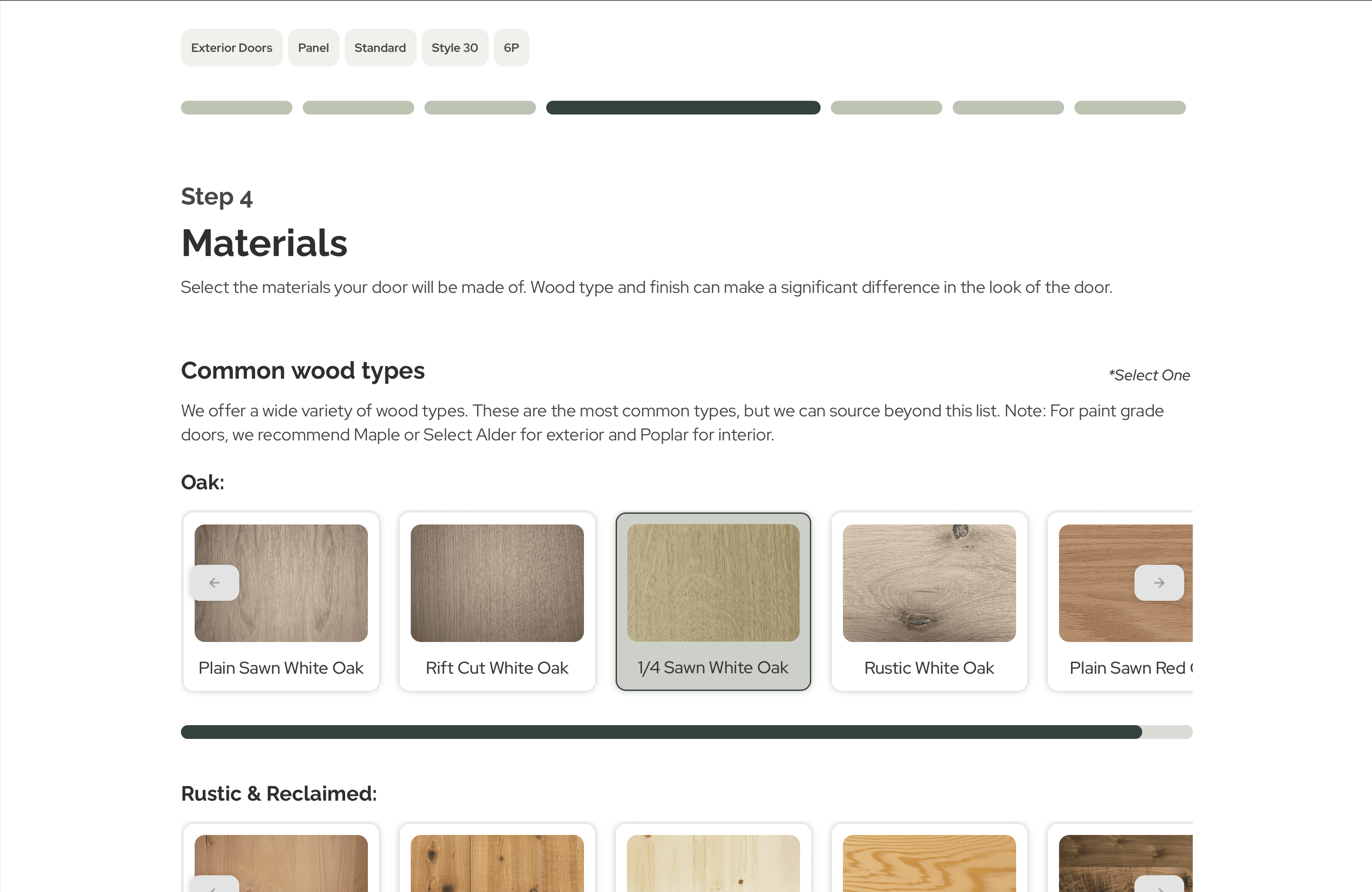
New feature design
We built a new feature for the website that allowed users to build their own custom door through the website. The goal for this was to ensure it could be built upon in the future while also allowing the target audience to visualize their custom door. Since it is not a sales website, the goal of the feature was to lead users directly into making contact with HSCD by storing their selections to get the conversation started.
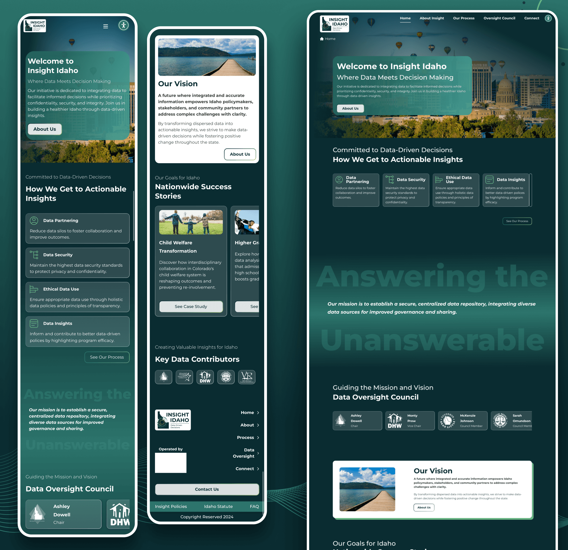
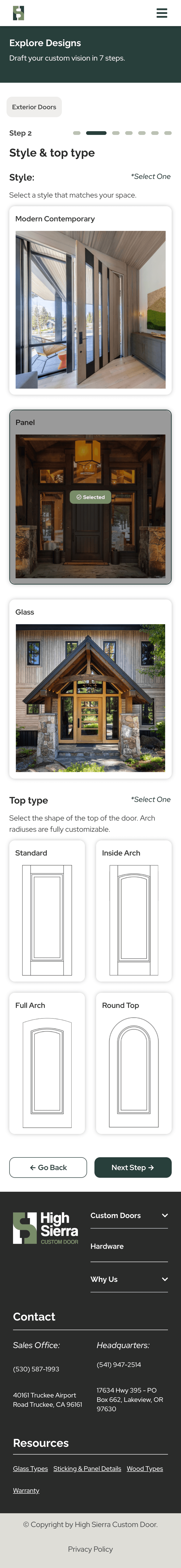
hi-fi web Design:
hi-fi Mobile Design:


Background
Into the weeds
The Process
Discovery
We started with a site audit: Could the flow be improved to accommodate users that would have different journeys?
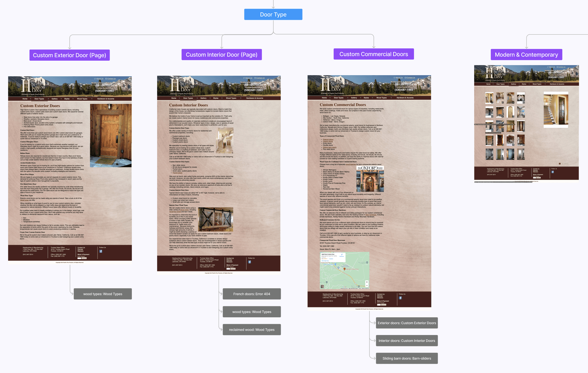
The current site was difficult to navigate on initial review.
The stakeholders knew this was a challenge and that they were asking users to figure it out on their own if they were new to the site. Contractors didn't have too many gripes about the current site, once they knew how to use it.
Showroom staff had to spend a lot of time on the phone walking people through how to navigate the website.
This was causing a cascade of other issues, taking hours of their time daily, to help clients understand what they can offer, instead of being able to target new clients.
Getting an in depth history on a 30 year old company.

Getting deeper into how HSCD got to this point, and what they really needed to invest their efforts in to grow more.
Finding out what the owners planned for the future of the company changed how we approached the rest of discovery. They wanted the company to be turn key if someone wanted to buy it in the future, and it didn't have the structure or content to pass on to someone else.
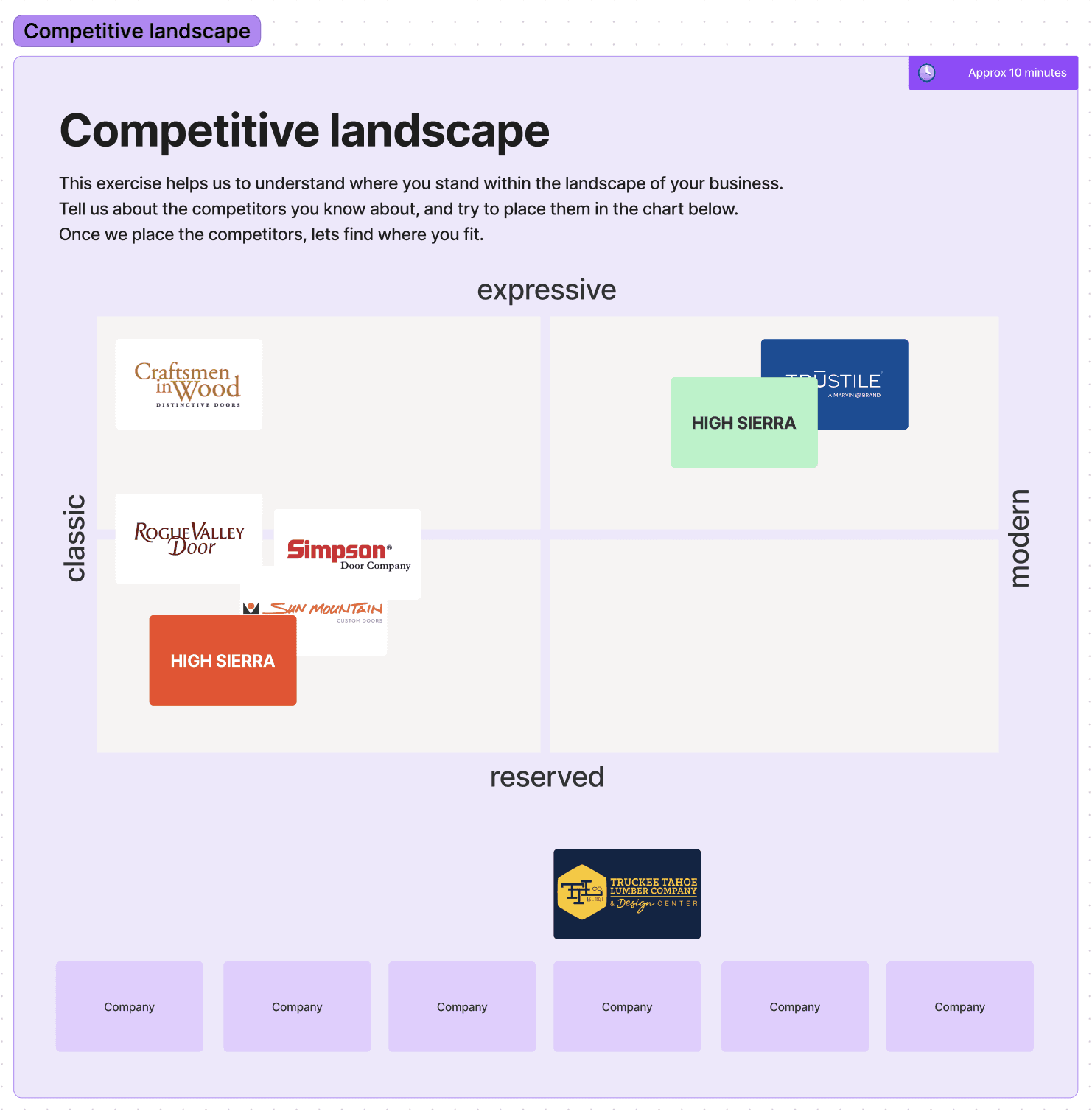
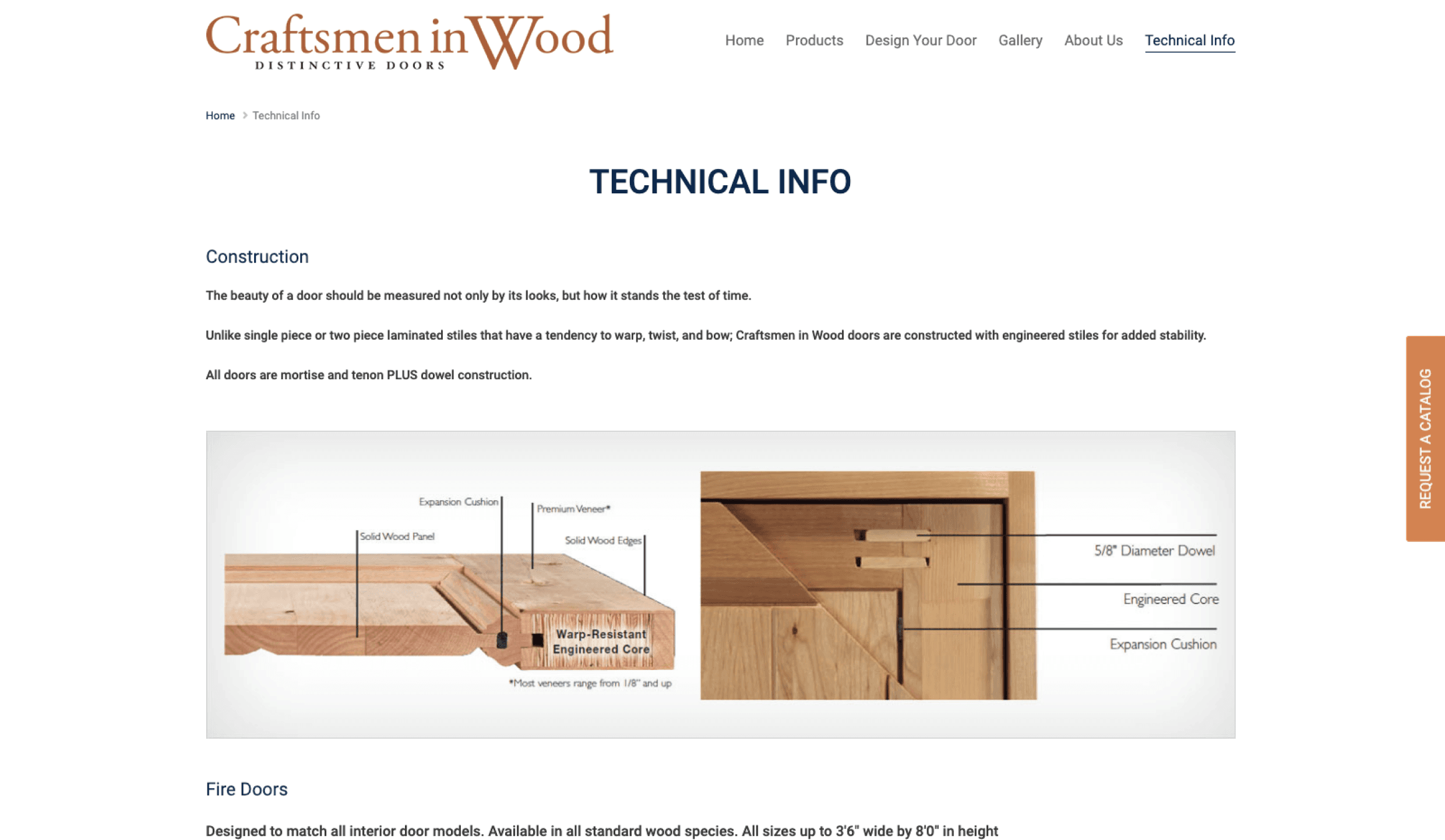
Competitive analysis: Finding out what works and what doesn't work for Trustile, Simpson Doors, Craftsman in Wood, and more?


How do they organize galleries, and selection options?
Some competitors offered filtering systems to get specific on galleries, while others leaned to deep clicks to get more and more specific on galleries.
How technical are they getting with door specs?
Competitors got more and more technical depending on how deep you were on the website, or simply just offered a page for technical content that was easy for contractors to access if they needed it.
Quotes from sales team interviewees:
"Quoting, styles, “take-offs”, styles... Gallery is garbage, Species isn’t great, Step process works well and is the most useful piece."
"Going back and forth between style tabs. users don’t know what these styles are without visual representation."
"Hardware is a backseat so it needs to be seen more. Need to show them what is carried and what they’re options are."
"Gallery is very confusing, hand-holding is necessary even just to track where the user is. Website doesnt answer the questions they have, so they call."
20 Second gut test: What style are we looking for?

The stakeholders liked simple foundations that were more modern.
Simple navigations and simple explanations were the way to go for HSCD. With the current struggle of confusion on their website, they were very open-minded, and wanted the new site to be very different than the current one.
The stakeholders didn't like pages that were overcrowded with imagery.
They also didn't appreciate stacked navigations, and websites with very limited color. Which created a challenge for us in creating something modern and professional, but using a lot of color.
Quotes from client/partner interviewees:
Site Map
Using simple terminology, while eliminating the confusing repetitiveness of the current site.
We spent some time trying on different terminology in the navigation and the page titles to make sure consistency was accomplished, and that the users would see what they were expecting to see on each page.

Lo-Fi Mockups
The current site's main issues were poor accessibility, inconsistent navigation, out-dated content and styling.
We tackled part of the accessibility problem in the lo-fi's by making all of our text styled and consistent, whereas the current website had different styling and fonts that were too small and difficult for average users to read. The inconsistencies were negatively impacting trust for users.
Making the navigation modern was the best route for HSCD. Their clients tended to look for doors that were modern, so it made the most sense to cater to what they were looking for.
Branding
When we landed in Tahoe, rebranding wasn't an option, and by the time we left, it was necessary.
During initial discovery, we did a brand audit meeting to let the client know what was working and what wasn't working for their brand. Their current logo was holding them back from creating the impression they wanted to have on their audience. Clients were starting to choose competitors because they had stronger brands, and better developed websites.
Using the brand sprint template, we were able to create a stronger first impression for the brand and open it up to contend with the competition.